The Zorn palette is a limited color palette made famous by Swedish painter Anders Zorn, known for its simplicity and versatility. Despite having only a few colors, it allows artists to create a wide range of tones and realistic skin colors, making it especially popular in portrait painting. Artists who study classical techniques often turn to the Zorn palette to improve their color mixing skills and understanding of values. Exploring what colors are in the Zorn palette reveals how a minimalist approach can still produce stunning results in fine art.
Understanding the Zorn Palette
A Limited But Powerful Palette
The Zorn palette traditionally consists of just four colors. While this may seem limiting at first, these colors were carefully chosen for their ability to mix well and replicate a surprisingly broad spectrum of hues. The palette is ideal for learning about color temperature, value relationships, and harmony in painting.
Origins of the Palette
Anders Zorn was a 19th-century painter who often used this restricted palette in his portrait works. While there is debate over whether he always limited himself to just these four colors, the palette named after him has become a staple in classical painting instruction.
The Four Colors of the Zorn Palette
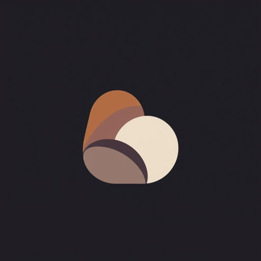
1. Yellow Ochre
Yellow ochre is an earthy, muted yellow that acts as the warm base in the palette. It’s used to create golden skin tones, highlights, and warmer browns. When mixed with red or black, it helps produce a range of warm hues and rich mid-tones.
2. Vermilion or Cadmium Red Light
Originally, Zorn used vermilion, a vibrant red made from mercury sulfide. In modern usage, cadmium red light is often substituted for safety and availability. This warm red is essential for mixing flesh tones, pinks, and creating contrast. It works beautifully with yellow ochre and black to give depth and variation to skin.
3. Ivory Black
Ivory black is more than just a dark pigment in the Zorn palette. It has a cool, almost blue undertone that allows it to act as a substitute for blue. When combined with white, it can create soft blue-grays that mimic cooler tones, including sky shades or fabric shadows. It’s a surprisingly versatile component in this limited set.
4. Titanium White
White is used for mixing tints and adjusting the value of the other colors. In classical oil painting, titanium white is preferred for its opacity and brightness. It helps create highlights, soft edges, and tonal variations in flesh, clothing, and background elements. It also allows for subtle value control without compromising the harmony of the palette.
Mixing Capabilities of the Zorn Palette
Surprisingly Versatile Color Mixing
Although it lacks blue and green pigments, the Zorn palette is still highly effective in producing the illusion of cool tones and subtle greens. Here are a few examples of what can be achieved with these four colors:
- Skin tones: Mixing yellow ochre and cadmium red light, with touches of white and black, can produce a range of lifelike skin tones from light to dark.
- Cool grays and blues: Ivory black mixed with titanium white creates soft blue-gray tones that can represent shadows or clothing.
- Muted greens: Although not vibrant, subtle greenish hues can be created by mixing yellow ochre and black, especially when used in context with warm tones.
- Rich browns: Combining all three color pigments without white can result in a variety of deep, warm brown tones perfect for shadows, hair, or background elements.
Learning Color Harmony
Because of its limitations, the Zorn palette teaches artists how to focus more on value, temperature, and brushwork rather than relying on bright colors. This fosters better control and understanding of the painting process. It emphasizes harmony and consistency across a piece, which is why it remains a favorite among art instructors and professionals.
Why Use the Zorn Palette
Perfect for Portraits
The Zorn palette is ideal for painting human skin, especially under natural or warm lighting. The warmth of yellow ochre and cadmium red, balanced by the coolness of ivory black, makes it easy to produce lifelike results. Many artists appreciate how skin tones can be mixed easily without overcomplicating the palette.
Beginner-Friendly but Professional
For beginners, the Zorn palette simplifies the color-mixing process. It eliminates the overwhelming number of choices and forces focus on mastering values and edge control. At the same time, experienced artists use the Zorn palette to push their limits creatively and maintain color harmony in their works.
Useful in Studies and Sketches
Artists often use this palette for studies, sketches, and quick portraits because it reduces decision fatigue. It’s also a practical choice for plein air painting or travel kits where carrying a full set of pigments isn’t feasible.
Limitations of the Zorn Palette
Restricted Hue Range
Because it lacks a true blue or green, the Zorn palette is not ideal for landscapes with bright skies or vibrant greenery. While skilled artists can create illusions of these colors, those looking to paint nature or modern scenes with saturated hues may find the palette too limiting.
Potential for Monotony
If not handled thoughtfully, the limited palette can lead to paintings that look too muted or similar in tone. It’s essential to pay attention to contrast, lighting, and compositional interest when working with such a narrow range of pigments.
Modern Adaptations and Variations
Expanding the Palette Slightly
Some modern artists choose to add one or two extra pigments to the traditional Zorn palette while still maintaining its spirit. Common additions include ultramarine blue or burnt sienna to expand the mixing possibilities without overwhelming the harmony of the original set.
Digital and Acrylic Adaptations
While traditionally used in oil painting, the Zorn palette can also be adapted to digital media and acrylics. Digital artists often replicate the palette using color picking tools, and acrylic painters can match the same hues using equivalent pigments. This approach helps artists maintain a consistent look across different media.
The Zorn palette, though limited in number, opens up a world of artistic possibility. With only yellow ochre, cadmium red light, ivory black, and titanium white, artists can create warm, harmonious paintings full of emotion and subtlety. This minimalist palette is a favorite among those who appreciate the beauty of simplicity and the power of thoughtful color mixing. While it may not suit every subject matter, it remains a valuable tool for mastering the essentials of portraiture, value control, and color harmony in painting.